Hey friends!
This long awaited post is finally here! The results of the Anime & Realistic divisions of CCCReview's Poster contest have been finalised and the prizes are ready to be claimed. The total score of each contestant is the sum of public voting (which closed on July 11th) and the judge's scores. Thanks again to everyone who participated and voted! Unfortunately, we couldn't chase up all the judges for their critiques, but a special thanks to our guest judges Armi (for the realistic division) and =JayHawk= (for the anime division).
Here's a recap of the prizes:
- 1st place = 50,000c (place item on shop-block for 100,000c)
- 2nd place = 25,000c (place item on shop-block for 50,000c)
- 3rd place = 10,000c (place item on shop-block for 20,000c)
ANIME
1st place - Kamex (paid)
2nd place - Ecstasy (paid)
3rd place - Mikasa
2nd place - Ecstasy (paid)
3rd place - Mikasa
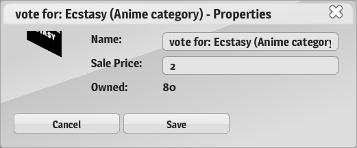 | ECSTASY |
Judge 1: 8/10
Very good anime poster in terms of the sketch (the face style is very anime), however, I think you used a bit too much of the furry brush tool, so the coloring ended up a bit smudgy.
Judge 2: 8.5/10
This entry captures the anime theme really well, especially with the large eyes and Pikachu hoodie. You need to work on blending colors since it appears smudged, especially around the hair, shoulders and neck.
Judge 3: 8/10
Nice sketch in terms of colour and shading. Similar to real coloured pencil drawing from its smudgy colour.
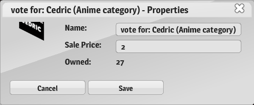 | CEDRICTotal Score: 55 |
Judge 1: 9.5/10
This is very similar to the real anime and I love it is such a clear poster but at the same time, there is still shine/shading. The clothes could do with some shading, but the face and hair are perfection.
Judge 2: 9.5/10
This is a really cute poster of Tomoyo and I like the amount of detail put into the eyes, hair and background. I wish this level of detail was also applied onto her clothes since it is a bit plain (if there was detail, it was hard to see because of the dark colors).
Judge 3: 9/10
Professional and the most realistic anime drawing. I like how detailed the eyes are drawn and the shading for the hair. Nice background with a shallow depth of view perspective. However, it'd be nice to see some shading on the dress.
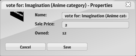 | IMAGINATIONTotal Score: 32.5 |
Judge 1: 7/10
Really cute chibi! Some color would've been nice, although, I do like how you made the hair detailed, otherwise the poster would've been too simplistic.
Judge 2: 7.5/10
Cute poster! I like the sketch of the little character and the level of detail put into the hair. However, the rest of the picture (body) was a bit too simple. This could be improved by adding something else so that it wasn’t just a black sketch (even if it was just making the sweater red, it would have stood out more).
Judge 3: 6/10
Nice little sketch but it needs more details.
 | KAMEXTotal Score: 116 |
Judge 1: 10/10
I love how the extent of detail on this poster. The brushes you've used to achieve this level of detail would've taken a long time. Looking closely, the shading is quite a smooth transition and not blurry. Amazing job!
Judge 2: 10/10
This has to be one of the best posters I’ve ever seen. The level of detail is outstanding; the shading on the clothes to show the creases, the darker section on the corner of the eye and the shiny apple and the textured skin are amazing! I also love how you used up the whole canvas.
Judge 3: 8/10
Detailed and good shading, image appears to be grainy and I assume it's done on purpose.
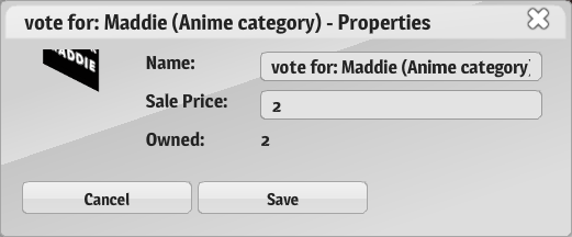 | MADDIETotal Score: 19 |
Judge 1: 6/10
Quite a cute drawing, but it's lacking details such as shading.
Judge 2: 6/10
Nice color scheme but I think you need to work on details. Maybe try adding shadows rather than outlines.
Judge 3: 5/10
Nice bright colours but lack of details.
Quite a cute drawing, but it's lacking details such as shading.
Judge 2: 6/10
Nice color scheme but I think you need to work on details. Maybe try adding shadows rather than outlines.
Judge 3: 5/10
Nice bright colours but lack of details.
 | XMIKASAXTotal Score: 68 |
Judge 1: 10/10
This is such detailed painting! So much detail in the hair, the clothes, everything. Great job!
Judge 2: 10/10
This is another amazing poster. This is very detailed in terms of shading and color and it’s detailed down to the strand of hair that flicks out! I love the colors used, they go well together. It could be improved by making the sketch more defined so that the facial features are more clear.
Judge 3: 10/10
Perfection
REALISTIC
1st place - Stark (paid)
2nd place - Keigh (paid)
3rd place - Venus (paid)
2nd place - Keigh (paid)
3rd place - Venus (paid)
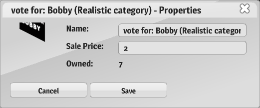 | BOBBYTotal Score: 25 |
Judge 1: 6/10
It looks more cartoon than realistic because of the coloring. Shading of colors would've made it look more realistic, but nice work with adding details to the face.
Judge 2: 7/10
I like the sketch of the man and how it’s been outlined. It could be improved by adding shading on the clothes and skin. It would have been great as a cartoon, but it was entered into the realistic category.
Judge 3: 5/10
This is an interesting entry. It would have been better if there had been a background of some sort to fill the empty white space on top. Also, it looks a bit more cartoon-ish than realistic.
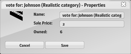 | JOHNSONTotal Score: 26 |
Judge 1: 7.5/10
Really nice painting, I really like the style. However, for the category of realistic, I think it is lacking details such as shading and shine.
Judge 2: 7.5/10
I like how simple it is, it’s not overdone in shading. I like the hair texture and how it’s shiny and wavy, good job. The eyes are also nice, and I like the shine. It could be improved by putting more detail onto the shirt and maybe changing the nose to make it more realistic.
Judge 3: 5/10
It's a bit difficult to recognize Bella Thorne from your poster. The colors you used were all accurate, but it's lacking in the realistic department.
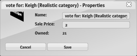 | KEIGHTotal Score: 46 |
Judge 1: 9/10
A bit smudged in some areas of the face but overall, a very good painting of Velvetcake with nice details. A lovely realistic portrait.
Judge 2: 8/10
I love how it’s all in grey scale except for the eyes, it makes the stand out. I love the collar bones and the skin texture, it’s smooth. It could be improved by choosing a smaller brush when sketching the hair so that the big strokes aren’t as visible and it’s more blended.
Judge 3: 8/10
I'm not sure who you based your poster on, but it turned out quite well. The details could be refined a little more though. It could do with more shading and better lighting.
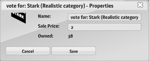 | STARKTotal Score: 66 |
Judge 1: 10/10
Very detailed and the facial features are clear. It looks very realistic. I think it looks a lot more like Ronald Weasely from Harry Potter though.
Judge 2: 10/10
This was my favourite realistic image. I like the grey scale, the shading and shine, especially on the skin (it gives it a nice texture). I love the detail, in particular the nose and wrinkles/creases on the face.
Judge 3: 8/10
The detail is commendable; however, I didn't immediately see Paul Mccartney in this poster. You have to observe the proportions of your reference, especially the distance between the facial features.
 | STYLETotal Score: 19 |
Judge 1: 6/10
It needs more details and shading in the face for a realistic painting.
Judge 2: 6/10
I like the hair color and style. I think this could’ve been improved by blending in the white circle that was used for the shine, and blending in the rosy cheeks so it was blotchy. I would have liked to see a body not just a head. Maybe more shading around the face would’ve been good too.
Judge 3: 4/10
I've found that it is more difficult to create realistic portraits if you use the face tools CCC provides. It is better to draw in the features yourself. I can tell exactly which tools you used for this poster, which isn't a good thing.
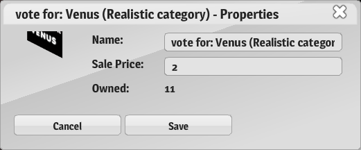 | VENUSTotal Score: 37 |
Judge 1: 10/10
It's smudgy in some parts but I could tell instantly that it is Lana Del Rey, so you've done a great job! I love how there's so much detail on this painting from the hair, to the face, neck and clothes.
Judge 2: 9/10
I like the greyscale in this picture and the transition from light to dark across her face. I think this picture clearly reflect Lana Del Rey because the facial features were detailed and almost exact proportions. I love the shiny hair and detailing around the neck and eyes.
Judge 3: 7/10
I recognized that it was Lana at first glance, which is good. You have to work on your proportions though e.g. how big the eyes are compared to the nose, how big the nose is compared to the mouth.
 | VERITYTotal Score: 36.5 |
Judge 1: 9/10
I can't say it looks like Gaga, but for a colored realistic painting, this is really good.
Judge 2: 8.5/10
I love the colors used in this poster, the light pinks, apricot and pale yellow look really good together. I like the facial features, they were drawn on really well. The hair was really detailed, I liked how you could see the lines, and I liked the dark shadow behind the neck (made it look 3D).
Judge 3: 8/20
It doesn't look like Lady Gaga to me but I like it all the same. I like how it resembles the cover of a magazine. The texture of the hair is rather nice too.
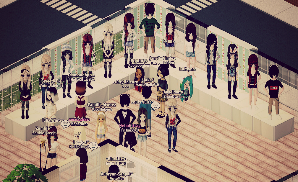
Congratulations to all entrants for their tremendous works! If you're in the top 3, please contact either Arden or FluffyUnicorn in-game to claim your prizes. If you would like to see all the entries, they are still available for viewing on level 3 of CCCReview headquarters (search CCCReview in player search bar in-game).
Posted by Arden, Armi, JayHawk & FluffyUnicorn
Posted by Arden, Armi, JayHawk & FluffyUnicorn